Corepel
Fast design for unbeatable durability
June 3, 2021 / Wulf Beck

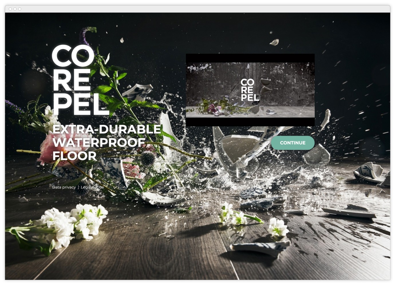
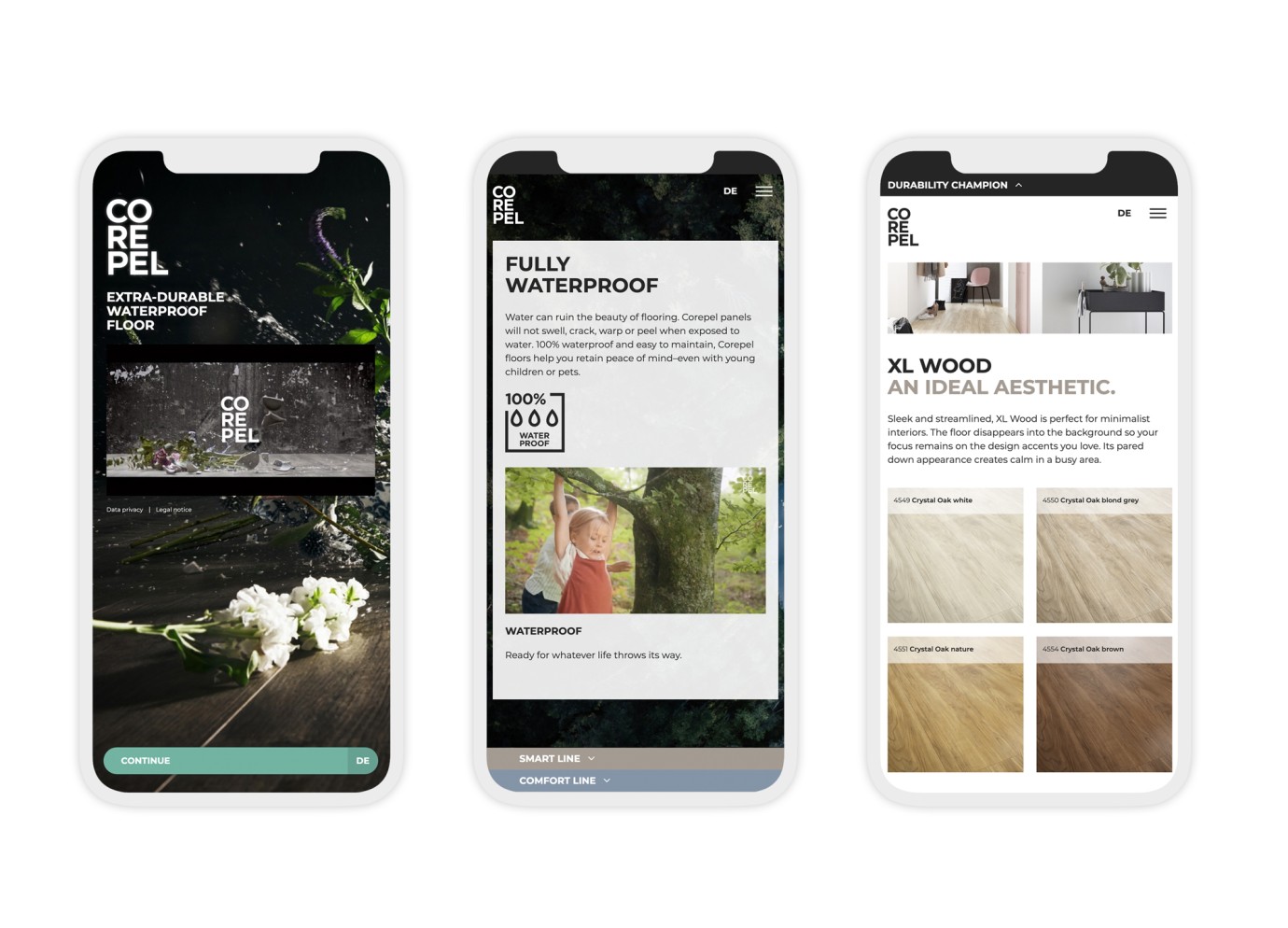
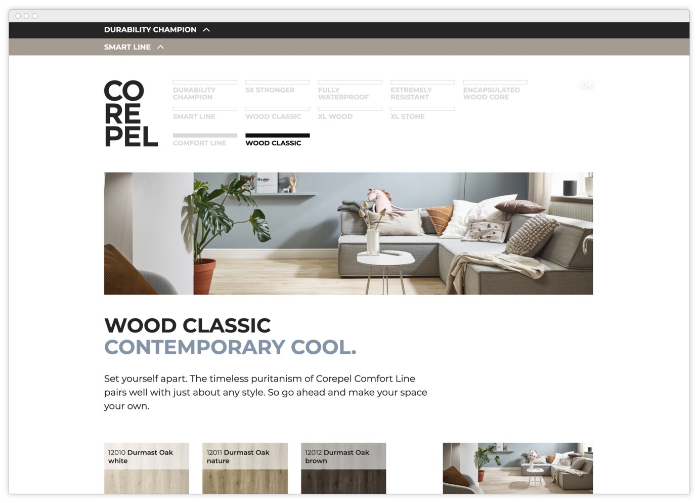
We created a product microsite for the new flooring brand »Corepel«, bringing it online for its launch and making it possible for customers to directly experience its product landscape. The result is impressive – and shows how successfull »speedboat projects« with a lean setup and precise goals can be.
More than ever, Turbine Kreuzberg considers itself a technology agency. »Design« therefore generally implies ensuring that design consistency and conceptual coherence are maintained in complex and long-running projects. An exciting and challenging task – even if it's not exactly what every Tom, Dick and Harry imagine design to be: no scribbles, creative workshops or mood boards, no weeks of searching for the perfect »drive« in the new logo. When there are so many stakeholders engaged and so much value in a project, changing a button in the dealer search can take several days without the use of a single design app.
So, that’s why it’s very welcome when a speedboat project with a focus on design pops up. In spring of 2021, a new line of design flooring that is particularly resilient and waterproof was launched in the market – Corepel. As a long-standing partner of the Swiss manufacturer of wood-based materials SWISS KRONO, it was our task to develop a microsite in preparation for launch to go with it: small budget, small team, tight schedule, no scrum, short lines of communication – but of course, nevertheless, with a thrilling result.
Achieving this without those weeks of searching for the perfect »drive« in the new logo was only possible due to the extensive preparatory work of branding specialists Martin et Karczinski (Zurich), who provided a fantastic construction kit with all design components and a strong product story. So their campaign, which had been developed for print and fairs, had to just be transferred »quickly to the internet«.
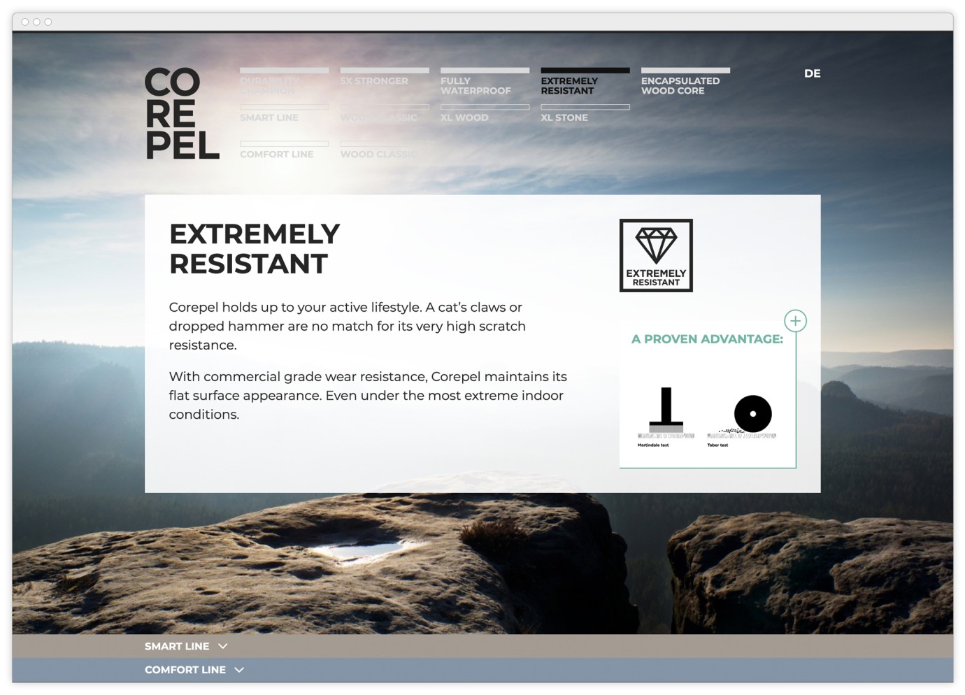
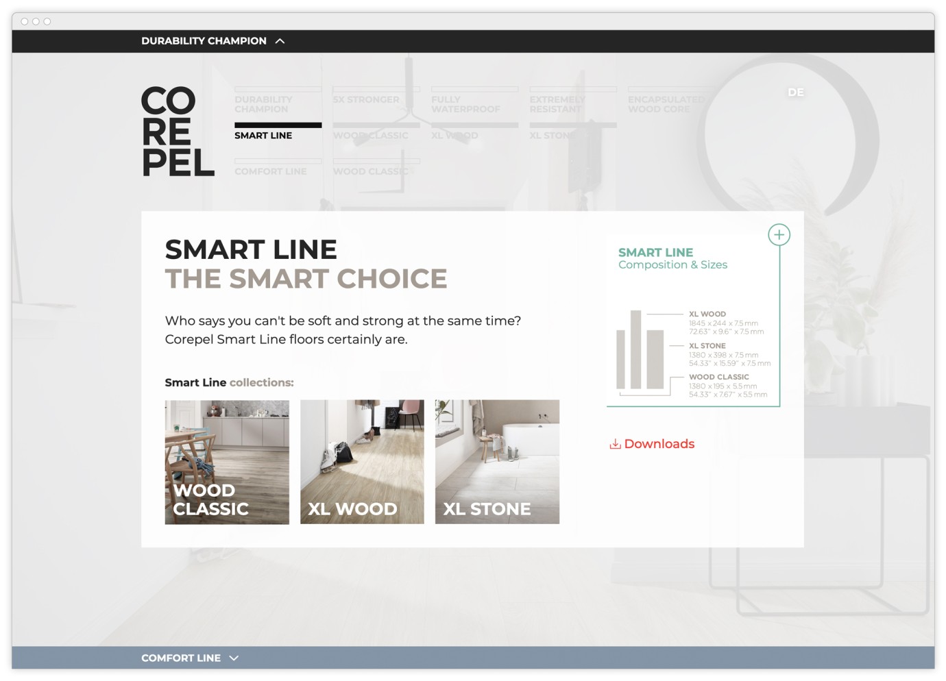
The result is exactly what was planned at the beginning: a sleek website that combines a large amount of information with a high »joy of use« level. This joy of use is the most direct consequence of the joy we experienced during production. The frequent ping-pong between design and frontend ensured a high level of (non-methodical) agility in the site's development. For example, the original idea of making all content horizontally accessible via swipe was discarded in favour of an easier-to-use, »cartographic navigation«. During the UX-self-testing (also a very popular speedboat method) it turned out that the clear, spatial presentation of the content works so smoothly that integrating an additional, horizontal accessibility of the content would have added no value to the UX – but it would have caused a lot of effort in implementing it.
And the development team had their own fun, too: our developers were allowed to use some cutting-edge technology, including GraphCMS, a headless content management system that offers complete flexibility in the creation of the front end. We also worked with the Nuxt.js framework, which is based on Vue and has a modular architecture that speeds up development quite a bit.
Although Corepel – with its unbeatable durability and special robustness – stands for the opposite of speed and agility, the client was so satisfied with the project and the result that they are considering numerous country rollouts in different languages. It is therefore very likely that the speedboat will turn into a heavy tanker – i.e. a classic Turbine project. A design that's especially pleasing to the eye and the ensuing great success in Corepel's target group are what is making it possible.
Wulf Beck, Design Director
wulf.beck@turbinekreuzberg.com
